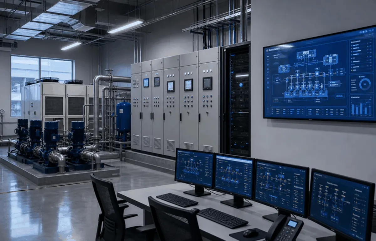
Good HMI and SCADA screens prioritize hierarchy, abnormal-state visibility, alarm quality, trends and consistent navigation over decorative graphics.
Key Questions
- Can operators see abnormal states within seconds?
- Do colors indicate status and alarm priority consistently?
- Can users move from overview to detail without confusion?
Implementation Path
- 1Define overview, area, equipment and detail screens.
- 2Reserve color for state, alarm and action priority.
- 3Validate screens with operators during commissioning.
Related Systems and Entities
Start with screen hierarchy
A clear hierarchy moves from overview to area to equipment to detail. Operators should know where they are, what is abnormal and what action is available without memorizing screen paths.
Design for abnormal situations
Color should be reserved for status and alarms, not decoration. Trends, interlock states and alarm priorities should help operators diagnose the process.
Make screens maintainable
HMI and SCADA screens should follow naming, symbol and navigation conventions. Consistent screens make equipment additions and operator training easier.
FAQ
Should HMI screens use realistic 3D graphics?
Only when they improve operation. For most control screens, clear hierarchy, status visibility and alarm quality matter more than realism.
What makes an alarm screen useful?
It separates priority, time, equipment, cause and recommended action so operators can respond rather than just acknowledge messages.
Industrial Software, Remote O&M & Legacy Upgrade
Remote service, SCADA access, smart factory visualization, energy management and practical upgrades for aging control systems.